Feature panels are full-width panels of images, used on pages where you want to promote something visually. For example a home page or a section header.
Feature
Video guides
On this page
We have a range of feature panels, as covered on this page. Most of them have a full-width image with some kind of text overlay.
Feature panels are stacked vertically on a page, and are always separated from each other by content panels. These are panels mainly made up of text, and have plenty of whitespace. This breaks the flow of the page, and allows the content to breathe.
Topic block

The topic block can only be used when the feature panel is NOT the first panel on the page.
The topic block is an optional addition to the feature panel that allows for a coloured block that contains text to be added to the top of the feature panel. The topic block has 4 fields.
1 – Topic block heading
This field is for the heading of the topic block which is displayed at the top in gold coloured text.
2 – Topic block sub-heading
The sub-heading is the content of the topic block and is used to provide extra information.
3 – Topic block link
If you chose to add a link to the topic block then the chevron on the right will appear to indicate the topic block is a link. Clicking anywhere on the topic block will then take you to that link.
4 – Topic block position
This option lets you choose if you want the topic block to appear in the top left or top right of the feature panel.
Overlay
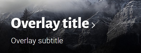
The overlay is similar to the topic block and has the same 4 options
1 – Overlay title
The overlay title is displayed at the bottom of the feature panel is bold white text.
2 – Overlay subtitle
The subtitle can be used to provide a little more information and is displayed as white un-boldend text underneath the overlay title.
3 – Link
If you chose to add a link to the overlay then the chevron on the right will appear to indicate the overlay has a link. Clicking on any of the text in the overlay will take you to the link.
4 – Overlay position
This option lets you choose if you want the overlay to appear in the bottom left or bottom right of the feature panel.
Feature types
The feature panel allows for several different types of feature. Some of these options have additional fields to fill out and these are detailed below.
Image
The image version of the feature panel is the default option and uses only the above options.
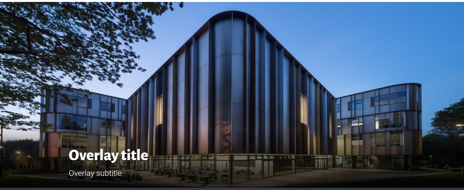
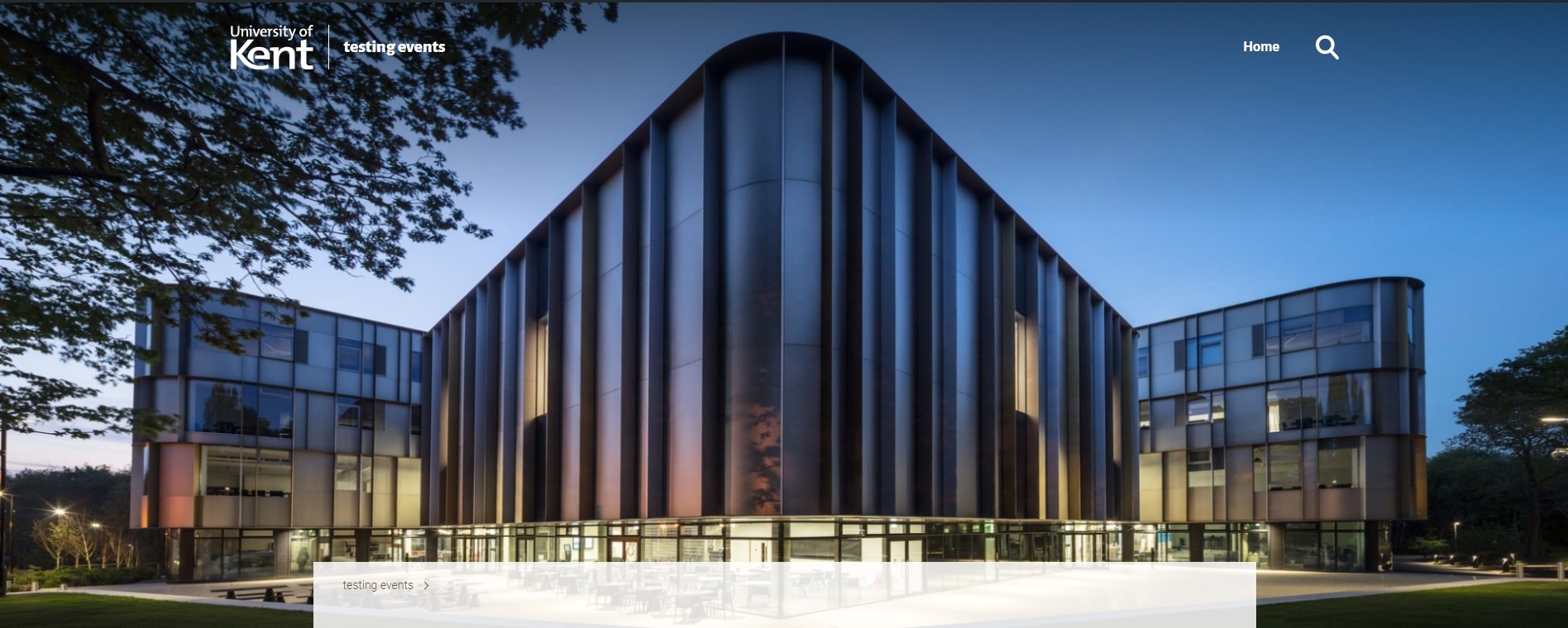
Page header
This version of the feature panel allows you to choose an image to use at the top of your page. The image will not have any extra content on it and is used purely for decoration.
You can view an example of this panel here.
Video
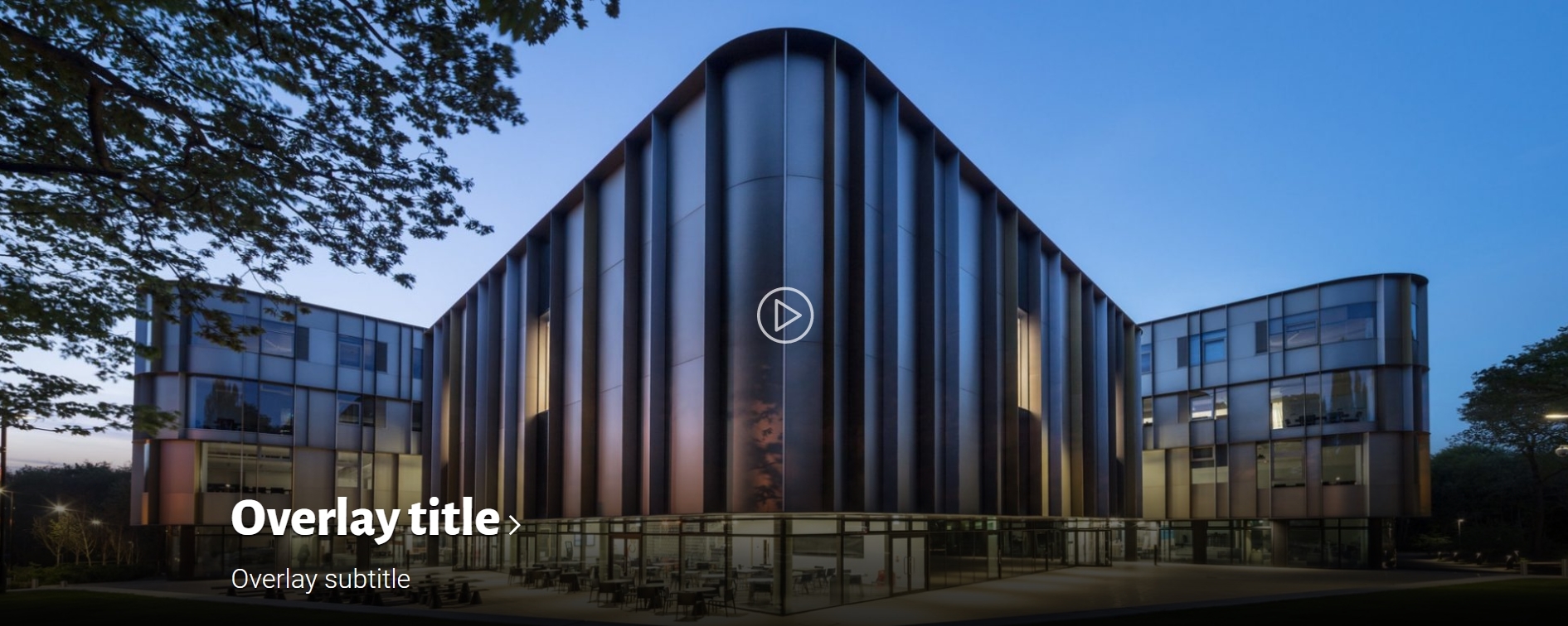
The video feature panel allows you to show a video after a user has clicked on the click through image. You can use the overlay or topic block options to detail what the video is about.
The video feature panel only has one extra field associated with it and that is the video link field.
1 – Video link field
Input any YouTube or KentPlayer link to this field and the panel will then play the video after the user has clicked on the click through image.
Map
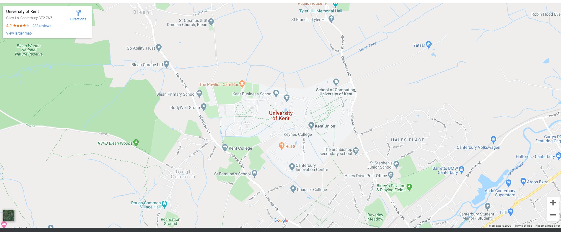
The map option of the feature panel allows for a specific location to be shown on google maps.
This version of the feature panel has one key option which is the map link, this shows the specific location of your choice.
1 – Map link
To get this link you will need to go to your destination on google maps and then click the share button that appears. Then choose the “Embed a map” option at the top of the box that appears and copy the link that is displayed and paste this link into the map link field of the feature panel.
Slider
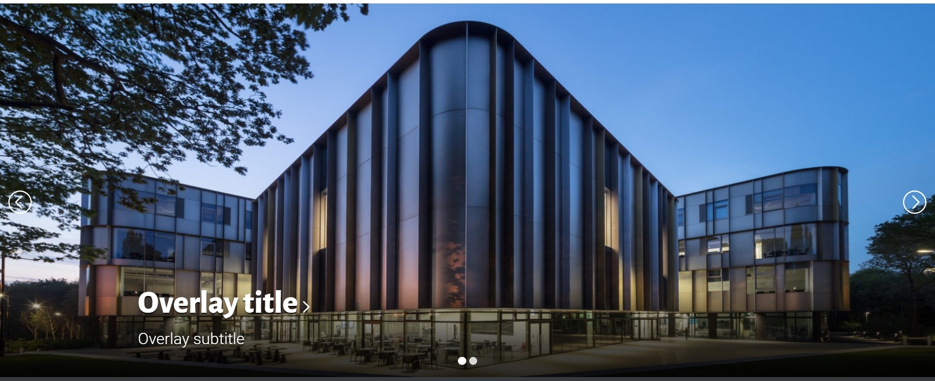
The slider version of the feature panel uses the same basic options as the image version however it allows for you to choose multiple images which the user can then scroll through. Each image can have its own unique overlay title/subtitle and link.
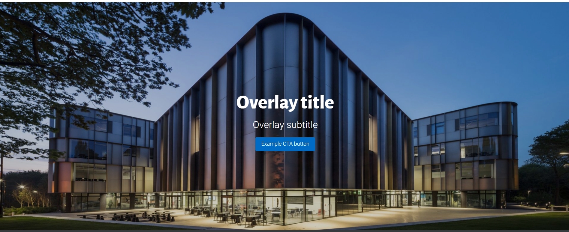
Call to action
The call to action version of the feature panel is similar to the image version however the text is centred on the image and a blue button that acts as a link is added which you can add custom text to.
This version of the feature panel only has one additional field which is the “Link text”.
1 – Link text
The link text is the text inside the blue button and in this field you can customize it to your liking.
Editorial
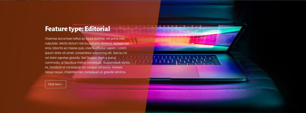
The editorial version of the feature panel allows for a large chunk of text to be added over an image.
This version has 3 additional fields, title, content and content align.
1 – Title
The title field is displayed at the top of the editorial box that is added to the image and is shown in the Kent blue lead text font and style.
2 – Content
The content of the editorial panel. This is where you write a large amount of text that can be used to help describe the image or story you are promoting.
3 – Content align
This option lets you choose if the editorial content is displayed on the left or right of the image.
4 – Text background
This defines the style of the background block, to either have no colour, a semi transparent colour, or solid colour.
5 – Text overlay background colour
Depending on the selection made above this defines the blocks colour. The ‘No colour (frosted)’ option blurs the image behind to look frosted, but this does noes work properly in Firefox and we have put in place a fallback which applies a transulcent black background instead.
Spotlight
The spotlight panel is used to highlight several news stories. It has 3 forms each a little bit different. These depend on the main option in the panel, the source.
1 – Local feed
The local feed will automatically pull the latest 5 posts and highlight these.
You can choose to only pull posts from a certain category by entering the name of the category in the “Category” field.
2 – External feed
The external feed will pull from a Kent news blog. It has 3 fields.
1 – Link
The link to the external blog to pull stories from, for example https://blogs.kent.ac.uk/kbs-news-events/.
2 – External category
This field allows you to only pull stories that have the category you enter applied to them.
3 – External tag
This field allows you to only pull stories that have the tag you enter applied to them.
3 – Manual
The manual option will allow you to manually enter the information for your stories.It has 4 fields.
1 – Image
The image to be shown to represent this story.
2 – Title
The title of the story, this will display over the image.
3 – Text
This is the text displayed when the item is hovered over with the mouse.
4 – Link
The location the user is taken to after clicking on the story.

Event
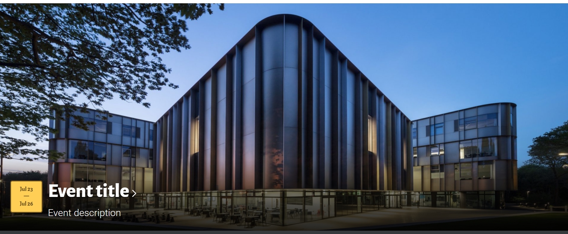
The event version of the feature panel allows you to promote a specific event. You can use the overlay title and subtitle to name and describe the event.
This version of the feature panel has 2 additional fields, event start date and event end date.
1 – Event start date
This field lets you input the date the event starts and is shown in the yellow event date box above.
2 – Event end date
This field lets you input the date the event ends and is shown in the yellow date box below. If the event is on one singular day then putting in the same date values in this field as the start date field will result in just the one date showing.
Examples
Shown below are examples of a few of the panel types and how they look.
Featured stories
Featured story
Featured story

Feature type: Editorial
Vivamus accumsan tellus eu ligula pulvinar, vel porta odio vulputate. Morbi dictum nisl eu posuere eleifend. Aenean nisi eros, lobortis ac massa quis, viverra efficitur sapien. Lorem ipsum dolor sit amet, consectetur adipiscing elit. Sed eu mi vel dolor egestas gravida. Sed feugiat diam a purus commodo, ut faucibus metus consequat. Suspendisse lectus ex, tincidunt et consequat vel, congue vel purus. Aenean neque neque, imperdiet nec consequat ut, gravida vel eros.


