Content
Video guides

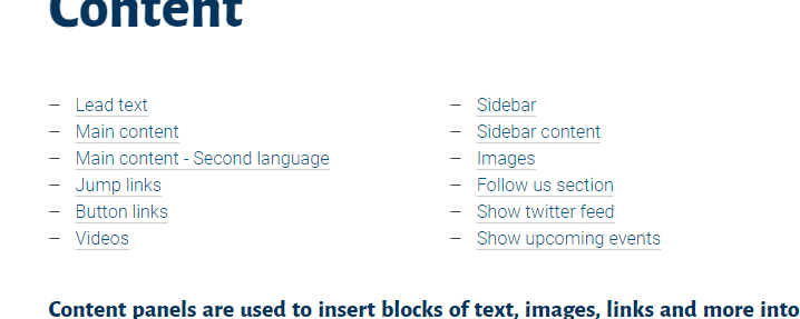
On this page
Content panels are used to insert blocks of text, images, links and more into a page and are one of the primary panels used to make pages on research.kent
Custom page title
It is possible to display a different page title at the top of the content page. This may be useful in scenarios where you have a collection of pages, such as an exhibition, and you require the page title to reflect the group name. By using the custom page title field you can apply your own label to the page title area of the content panel without affecting the oage address or SEO. Then you can put the specific page name either as lead text or within the main content directly.
Click here for an example of a page with a custom page title.
Page links
On pages with lots of information you may want to break this down into easy sections for people to navigate between. One tool available to help with this are ‘Page links‘. These are a series of links which appear at the top of the page.
First, you need to give your sections (preferably titles) unique ID’s. To do this you will need to go into the ‘Text‘, find your relevant title / section and add in ‘id=”…..”‘ as shown below. Your id value must be unique, you cannot have multiple id’s with the same value on the page.
<h3 id=”section-title”>Section title</h3>
- The important part here is the id=”section-title”. Each sections header must have an id associated with it
- It does not matter if you are applying this to a h1, h2, h3, h4, h5, or h6 header or even a p paragraph tag
- You will need to use the ‘Text‘ view to add this value / make this change
Once you have done this navigate to the ‘Page links‘ tab on the left side of your content panel and click on the ‘Add link‘ button. The ID value must be what you added to your header tag, i.e. ‘section-title’. The Label field can be anything you wish to enter.
Lead text
Lead text is used as an entry into the page, providing a narrative for the page. When selected and used the text will be in bold, have a dark blue colour, a different typeface applied, and the entire block will have a line dividing it from the main content.
This is an optional field however and should only be used once at the top of the page.
To add lead text navigate to the ‘Lead text‘ tab on the left side of your content panel and add your text into the textarea field.
Main content
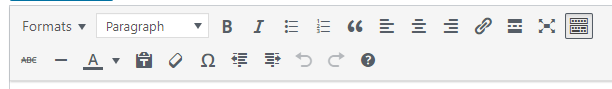
This is the main field on the panel where you will enter text, images, assign links, etc.

The editor itself is easy to use. To begin with you can copy and paste text in Word, NotePad, etc and any links or styling you have applied should be carried across.
From left to right you have the following controls available:
- Formats
- Styles
- Bold
- Italics
- Bullet lists
- Numbered lists
- Blockquotes
- Left align
- Centre align
- Right align
- Hyperlinks
- Insert read more – Not used on research.kent
- Fullscreen
- Toolbar toggle – You have to click this to display the options below
- Strikethrough
- Horizontal line
- Text colour
- Paste as text
- Clear formatting
- Special character
- Decrease indent
- Increase indent
- Undo
- Redo
- Keyboards shortcuts
Most of these functions are self explanatory and very easy to use, but there are a couple worth noting:
- Formats – This option will change over time but for now it allows you to wrap text in a colour box to make it stand out on a page.
- Styles – This dropdown list provides you with options to style text as various sized headings or just as plain paragraph text.
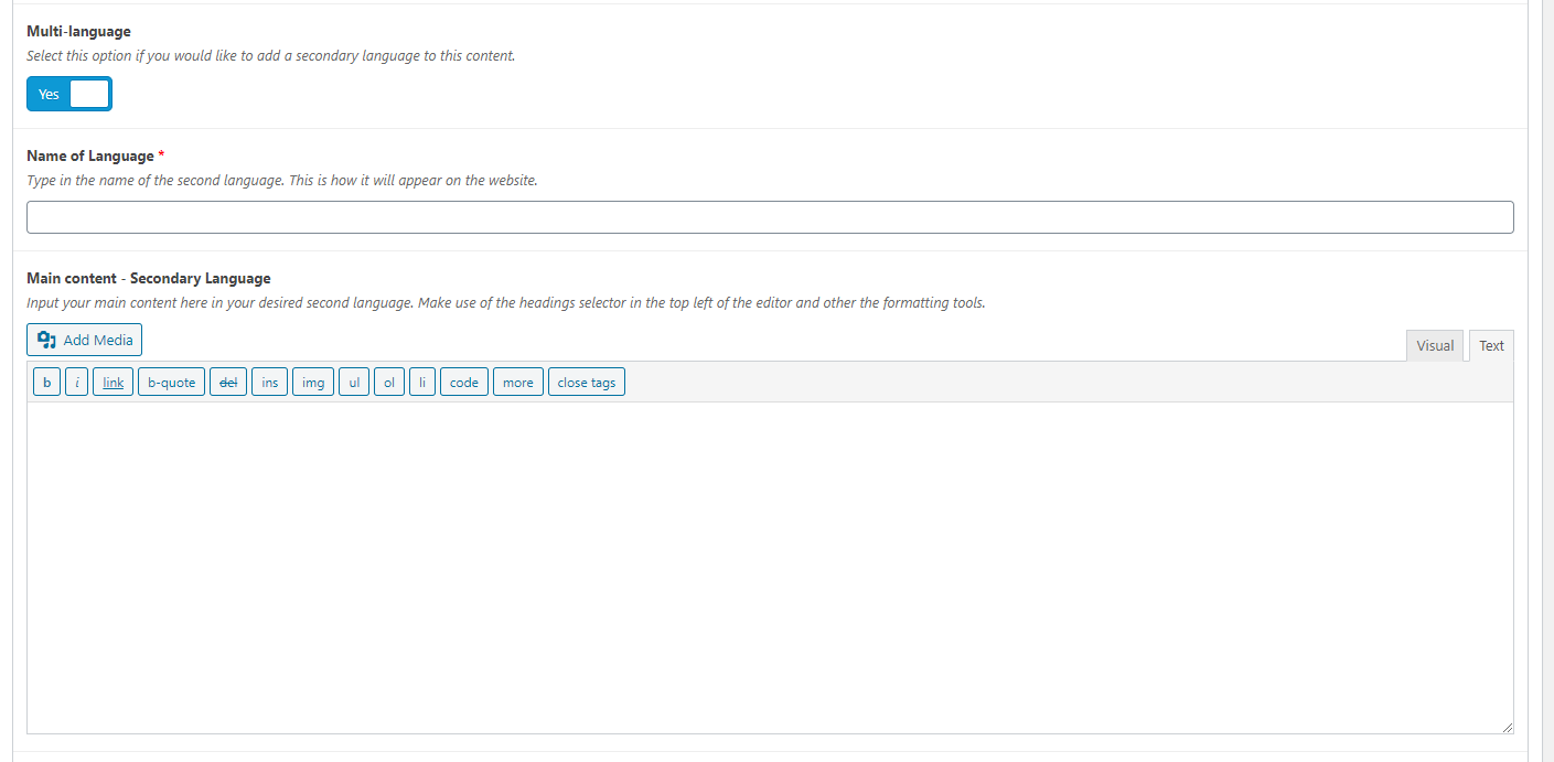
Second language option
The content panel also has an option to enter text for a another language. To activate this just click on the ‘Multi-language‘ toggle switch.
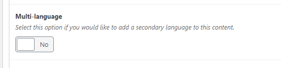
Two additional fields will appear below allowing you to enter a name for the language and another content field for entering text. This secondary language field works exactly the same as the main content field allowing you to insert media and links, and style your text as desired.
It is important to note that the first language will always be labelled as ‘English‘ and this cannot be changed. Also, there is no automated translation integrated, so any text entered into the secondary language field will need to already be translated into the desired language.
Button links
When adding links to your pages you can also have a featured link. The link can be either a primary button, secondary button, or a chevron link. You can highlight the text you wish to create a link and select the Primary button, Secondary button, or Chevron link options under the Formats dropdown, alternatively you can use the HTML snippets below to accomplish the same task.
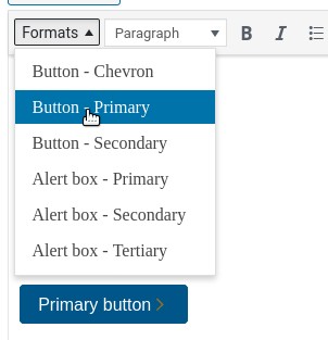
<a href="#" class="text__featured-link u-chevron-button">Primary button</a><a href="#" class="button button--primary text__featured-link u-chevron-button u-chevron--inverse">Secondary button</a><a href="#" class="button button--secondary u-chevron-button">Chevron link</a>Videos
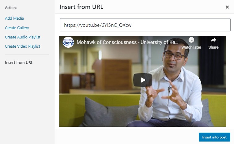
You might want to add some videos to the content panel to provide some visual information. You may insert videos from Youtube or Vimeo.
To add a video:
- Click the blue “Add Media” button located directly above the text field for the content panel.
- A box will appear allowing you to choose from images uploaded to the site. Click on the “Insert from URL” option on the left side of the box.
- Insert the URL of the video you wish to add and click the blue “Insert into post” box in the bottom right.
Gallery
WordPress has a built in gallery function, as shown below. To use such a gallery just click on the “Add Media” button above the WYSIWYG box, and then select “Create gallery“. Here you can choose which images you wish, and then choose how many to display per row, if they show be randomsied, and the size of the images used.
When a user clicks on one of the images it will take them to a page showing a larger version of the image, which they can click on to view the original file. They are also shown the image title, and if applicable the caption and description.
-

- Picture of an instructor pointing to a white board
-

- Picture of two people talking.
-

- Picture of students sitting at terminals.
-

- Picture of three people walking.

-

- Picture of people entering and exiting a building
Sidebar
Sidebars are entirely optionally with the content panel, and each content panel on the page can have its own sidebar. Each panel has one main sidebar with a range of configurable options.
Sidebar content
 This is where you can add groups of links to the sidebar. This is an optional field, and it is also possible to have multiple groups of links. Each group added can have its own title.
Here you can choose to either manually add links to a page or add a menu. Using a menu can be useful when replicating the same links on several pages and make it easier to update several pages at once.
To manually add links:
- Leave the toggle option ‘Links or Menu?‘ set to ‘No‘
- Begin first by creating a new group of links by clicking on the blue ‘Add row‘ button in the ‘Sidebar content‘ section
- Next give the group a title. If this is left blank it waill automatically apply ‘In this section‘
- Then add a row for each link desired. Click the ‘Add row‘ button
- Then click the ‘Select link‘ button and type in or select the link URL and text
To utilise a menu instead:
- First create a menu for your links within the ‘Appearance > Menus‘ section of the dashboard
- Copy the ‘Menu Name‘
- Now, on your page(s) where you wish to add your menu, on the relevant content panel set the toggle option ‘Links or Menu?‘ set to ‘Yes’
- Then input the name of the menu you wish to use
The menu items will now appear as ordinary sidebar links.
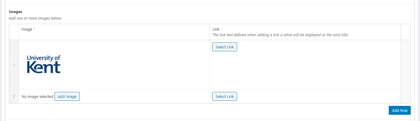
Images
You may wish to add logos to the sidebar of organisations affiliated with or have assisted with a projects. The ‘Images‘ section of the sidebar allows for this. You can add one or more images and they can also be linked (optional).
To add an image:
- Click on the blue ‘Add row‘ button within the images section
- Click the ‘Add image‘ button to select / upload your desired image
- Then click the ‘Select link‘ button and type in the link URL and text
Follow us section
You can add links to major social media accounts here. Options available are: Twitter, Facebook, LinkedIn, YouTube, and Instagram.
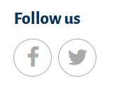 To add a link:
- Click on the blue ‘Add social media platform‘ button
- Select the platform of the link. This option defines the icon used
- Next click the ‘Select link‘ button and type in the link URL and text. Each link added will be on a new row so it is worth adding some descriptive text to the link.
- To add another link click on the blue ‘Add social media platform‘ button again to add another row

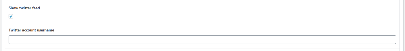
Show twitter feed
This will display a small Twitter feed for a specified account username such as ‘@unikent‘. It is important to include the @ symbol at the start for this to work.
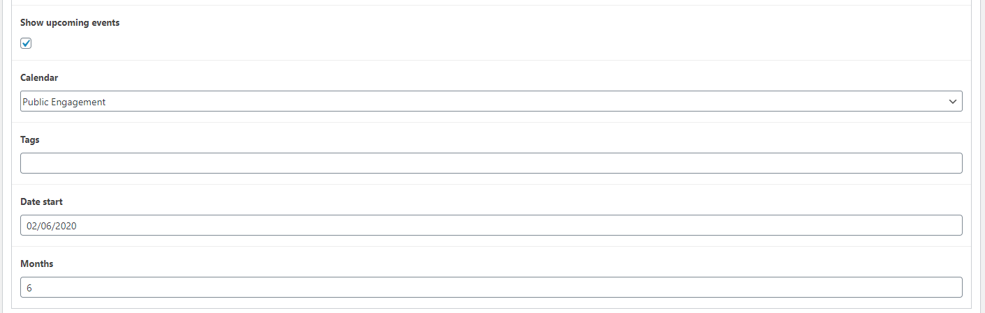
Show upcoming events
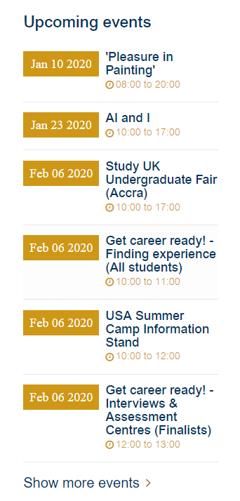 It is possible to display a list of events in the sidebar for a specified calendar.
There are four options available:
- Calendar – Select from a drop down all available calendars on Events Factory. Only one calendar can be selected
- Tags – Manually type in a tag used on events to filter the events shown
- Date start – This uses a date picker tool, but you can manually type in the date also. It is possible to select a date in the past or future
- Months – A number to define how many months to show, useful if you have events several months in advance which you need to show
Additional settings
Padding
You can control the padding for the content panel to bring it closer to neighbouring panels. You can adjust the padding above and below the panel independently, with the options ‘Normal‘, ‘Medium‘, ‘Small‘, and ‘None‘.